
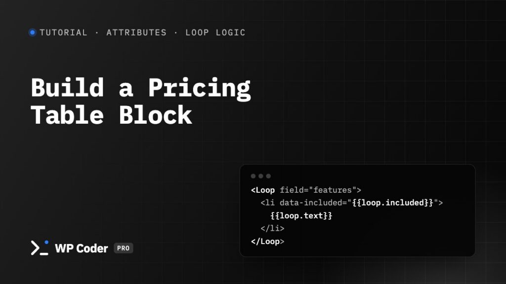
In this tutorial you build a pricing card that editors place as a block and fill in themselves: plan name, price, a “Most popular” switch, a list of features with ✓ / ✗, and a button. Three cards side by side make a pricing table.
You’ll use: Attributes (Text, Number, Toggle, URL, Repeater), Loop Logic and the WP Coder Snippet block.
Time: 15 minutes.
Step 1. Turn on Loop Logic#
Go to WP Coder Pro → Tools → Site Tools, switch on Enable Loop Logic and click Save.
Step 2. Create the snippet and its fields#
Create a new snippet, Pricing card, and open the Attributes tab. Add these rows:
| Attribute name | Field type | Default value | Label |
|---|---|---|---|
plan |
Text (single line) | 5 sites | Plan name |
price |
Number | 39 | Price |
period |
Text (single line) | one-time | Price note |
featured |
Toggle (on/off) | (empty) | Highlight this plan |
badge |
Text (single line) | Most popular | Badge text |
features |
Repeater (list of items) | text:text,included:toggle |
Features |
button_text |
Text (single line) | Get started | Button text |
button_link |
URL / link | /checkout/ | Button link |
For the repeater, click { } beside the Default value to open Edit Repeater Fields, enter text:text,included:toggle (the dialog lists every sub-field type) and click Apply: a text field and an on/off switch per row.
Step 3. The HTML#
<div class="price-card" data-featured="{{$featured}}">
  <If field="featured" value="1">
    <span class="price-card__badge">{{$badge}}</span>
  </If>

  <h3 class="price-card__plan">{{$plan}}</h3>
  <p class="price-card__price">${{$price}} <small>{{$period}}</small></p>

  <ul class="price-card__features">
  <Loop field="features">
    <li data-included="{{loop.included}}">{{loop.text}}</li>
  </Loop>
  </ul>

  <a class="price-card__button" href="{{$button_link}}">{{$button_text}}</a>
</div>
What happens here:
{{$name}}prints a field’s value.<If field="featured" value="1">shows the badge only when the switch is on.<Loop field="features">repeats the<li>for every row;{{loop.text}}and{{loop.included}}are that row’s fields.- The Toggle values (
1or empty) go intodata-attributes, so the CSS can style featured cards and missing features without extra markup.
Step 4. The CSS#
.price-card {
  position: relative;
  display: flex;
  flex-direction: column;
  gap: 12px;
  padding: 28px;
  border: 1px solid #e2e8f0;
  border-radius: 14px;
  background: #fff;
}
.price-card[data-featured="1"] {
  border: 2px solid #2563eb;
  box-shadow: 0 20px 50px -25px rgb(37 99 235 / .45);
}
.price-card__badge {
  position: absolute;
  inset-block-start: -12px;
  inset-inline-start: 24px;
  padding: 2px 10px;
  border-radius: 99px;
  background: #2563eb;
  color: #fff;
  font-size: 12px;
  letter-spacing: .04em;
  text-transform: uppercase;
}
.price-card__plan { margin: 0; font-size: 18px; }
.price-card__price { margin: 0; font-size: 44px; font-weight: 700; line-height: 1; }
.price-card__price small { font-size: 14px; font-weight: 400; color: #64748b; }
.price-card__features { margin: 8px 0 16px; padding: 0; list-style: none; display: grid; gap: 8px; }
.price-card__features li::before { content: "✓"; margin-inline-end: 8px; color: #16a34a; }
.price-card__features li:not([data-included="1"]) { color: #94a3b8; text-decoration: line-through; }
.price-card__features li:not([data-included="1"])::before { content: "✗"; color: #94a3b8; }
.price-card__button {
  margin-block-start: auto;
  padding: 12px 16px;
  border-radius: 8px;
  background: #0f172a;
  color: #fff;
  text-align: center;
  text-decoration: none;
  font-weight: 600;
}
.price-card[data-featured="1"] .price-card__button { background: #2563eb; }
Keep Inline off: the CSS is the same for every card, so it loads once from a file, on pages with the block.
Step 5. No Display Rule#
Leave the Conditions tab without Display Rules — the snippet is shortcode-only and appears only where you place it. Save.
Step 6. Build the table#
- Edit the pricing page and add a Columns block with three columns.
- In each column add the WP Coder Snippet block, choose Pricing card and click Load Preview.
- Fill in each card in the block sidebar: plan name, price, features (add rows with +, and switch included on for each feature the plan has — new rows start with it off, shown as ✗). Switch Highlight this plan on for the middle card.
Turn on Tools → Developer → Block Field Picker, then press Click to edit in the block toolbar: clicking any part of the preview — the price, a feature — jumps straight to its field.
Variations#
- Monthly / yearly prices: add a Select attribute
billingwith optionsmonth:Monthly,year:Yearlyand show different text with<If field="billing" value="year">…<Else />…</If>. - Icons instead of ✓ / ✗: add icons named
checkandxon the Icons page and print<If field="included" value="1">{{svg.check.color}}<Else />{{svg.x.color}}</If>inside the loop. - Use it as a shortcode: Copy with attributes in the sidebar gives a shortcode with every field except the repeater — the features list can only be filled in the block.